
Why is documenting architecture hard? (2/10)
Part 2/10 in a series where I discuss why documenting architecture is hard. My goal is to help developers identify the issues they’re having, articulate the challenge, and then solve it. We will go down rabbit holes. I hope you like rabbit holes.
As I mentioned previously, there are five diagram “dimensions” developers keep packed in their minds when creating a diagram, let’s look at the first one.
Structural (Write-time; when you write it)
This topic is concerned with how code is “structured” when it is written. It’s not so obvious how to diagram that because unlike building schematics, a developer must think in multiple orthogonal structures at the same time when describing software.
As a side note, I personally really do believe if developers thought proactively and with structure about this topic they would end up with better codebases on average. It’s unfortunately a very common experience for me to meet a developer who doesn’t understand the fundamental structure of their own project, or holds an entirely incorrect model of their system in their mind (how they think it works isn’t how it really works — even when they wrote the entire thing themselves).
The most obvious “structure” is how code is organized in terms of functions, classes, files and folders, but simply drawing a map of the filesystem won’t tell you anything unless the file organisation is well thought through. You can’t ensure a file structure explains the project because meaning inside the boxes disappears the moment a developer creates a nebulous “util“, “helper”, “common”, “manager“ organisational unit, and similarly you have no idea how things are connected.
A program where everything is in one big file might have a similar structure to one where things are broken into files or folders. Think about this for a moment: many projects would work fine if the class and function definitions were in one large main file, they would still have some form of similar structure (if the references and control-flow didn’t really change), but indeed the code would be more confusing to humans. Do you have a folder per layer, or a folder per module? Do you use one of those methods some places in the code, and have ad-hoc parts of the project where any folder or file name goes? Are they strictly enforced, aiming for some hard to specify “ideal”, or is the structure entirely free from constraints?
Is our conceptual architecture mirroring the files and folders (for example to group business logic into one folder), or do we use files and folders grouped by architecture layers but still consider things with similar names across all folders to “belong together” ? Do we even have a concept of what belongs together and what doesn’t? How well is that boundary defined? Beyond this we even need to think about where code is written at write-time. Are we working in a mono-repo or multiple repos? Will we package and deploy code to be used in some other possibly unknown context (and do I show the package in the mono-repo or in the repo it’s used in?)? Do I draw my write-time or my run-time code? Do I fit all of that into one diagram?
Let’s look at a “starter project” for NextJS as a concrete example.
Note: In this series we will hop through multiple languages and frameworks to show this problem is not unique to one specific language or ecosystem. For those of you who never used NextJS: imagine something like a simple “Single Page React App” with a NodeJS backend, and one shared monolithic codebase.
These diagrams mirror the file structure. One could make a strong argument that each “folder” is a “layer” for a NextJS app, but that isn’t so obvious and it could also be disputed. However, it would be more difficult to convince someone these folders group discrete features and all their related components.

Just mirroring the “important parts” of the file structure is relatively useless. I don’t gain a new insight about the system that’s different from the file structure. It might be nicer that this view “filters out the noise”, but the value of that is questionable at best.

Adding more details didn’t tell me anything interesting either. I’d even argue it reduced the usefulness of this diagram because a lot of those details just aren’t relevant when I want to explain the architecture to someone.

A program on “Punched Cards“ has no real file system, files, or folders. The sections are written on the side of the cards (“SKEL“, “PFMT”, etc) and order is hinted at by the long red diagonal line. Can it still have an architecture without files? (Answer: yes.)
Photo by Arnold Reinhold CC-SA3.0
These diagrams might look prettier than a directory listing, and it might even be something an executive puts on a slideshow for an audience that wants to be convinced “yes, there’s an architecture there”. However, outside of executive-level politically-motivated internal-marketing power plays, there’s just no real meaning or value to any stakeholder who needs to make use this diagram. It doesn’t help a new developer on-board faster. It doesn’t help a team decide how to build their features, change their code, or identify risky parts. Even the textual directory listing is equally good (or possibly better) at describing how the app is built. It doesn’t help stakeholders really understand what was built. It doesn’t help communicate with other teams. They’re relatively useless and it doesn’t matter how much detail or how little detail we put into it.
This is interesting because these diagrams are highly accurate (and one has more detail than the other) but it seems that “being accurate” or “adding detail” is not the most important thing to have in a diagram. Something important is missing here. The diagrams shows groupings by types of things in the software (pages, styles, public assets), but it doesnt show what elements are working together and how they’re connected.
When one function “uses” something from outside of a function, it makes a function call by referencing the function name. To get that from another module we can search for the import statements. What happens if we draw arrows to show import statements?

With a few simple arrows we can gain insights about the app’s design that were hidden before, and we even understand more about how it is wired together, but we didn’t really cross a threshold of value where it’s worth creating this diagram. It might have even raised new questions such as “Why do _document and Hello have no arrows?”, or “What do these arrows mean?“. We’ll explore the themes behind those questions more in future posts, but for now let’s think about this one: How might we represent the true logical structure of this application and not the file-system based structure?

This diagram is instantly more intuitive, even for people who don’t know anything about NextJS.
It tells you there’s two applications: Backend and Frontend
It tells you each application has one endpoint
It tells you the index page uses the “home” style.
It tells you there’s no inter-dependency between Backend and Frontend code
Note: In this is a true statement about this code, but not NextJS in general. It could be that a developer writes a “common_constants.js” file and both apps import it.
Unfortunately, this diagram is also very confusing because the logical structure that developers build up and hold in their mind is usually not indicated anywhere in the files or the code. You must gain “special knowledge” of how it all works in order to interpret it and build that diagram. This mental model of the app is inaccurate and missing some details, but it is still more useful to onboard someone and explain the app structure than the file-structure diagram was.
Developers often run into one major stumbling block when they want to diagram their architecture: there is often a massive asymmetry between how developers think about the structure of code they’ve written and how they organize the actual code. It gets worse because it’s hard to articulate the model held in a brain, but it’s easy to generate a diagram based on code, so this “incorrect” or “unhelpful” version gets shipped around.
It might lead to better code when the code organisation matches the structure we want to see in diagrams. I follow this practice myself to great success, but this is a much deeper topic that should get its own 10 post series. I should also tell you: “it doesn’t always make sense to do it that way“, because it’s not the ultimate answer to this problem, and it’s not always pragmatic to do it that way, but it can help a lot if you have a situation that permits it. At the start of this post I shared an image of a deck of punched cards with red ink making up the side of the deck to indicate structure.
Let’s take a small detour here to think about something: grouping by “type of thing in my system” was a constraint imposed on how programs were written in the 1920s-1950s, and somehow that’s been carried forward into the 2020s as a default idea for how we should structure things inside our projects. This photographed punched card deck likely has the exact same issue as our NextJS application: all the things that change together are spread out over every section in the deck. The only advantage we have in 2020 is that we don’t have to re-type every card when we decide to change something, which reduces the pain significantly — yet we often do need to change a dozen files over a dozen folders, and developers usually notice the complaints about this problem after a codebase that is “grouped by type” turns 4 years old.
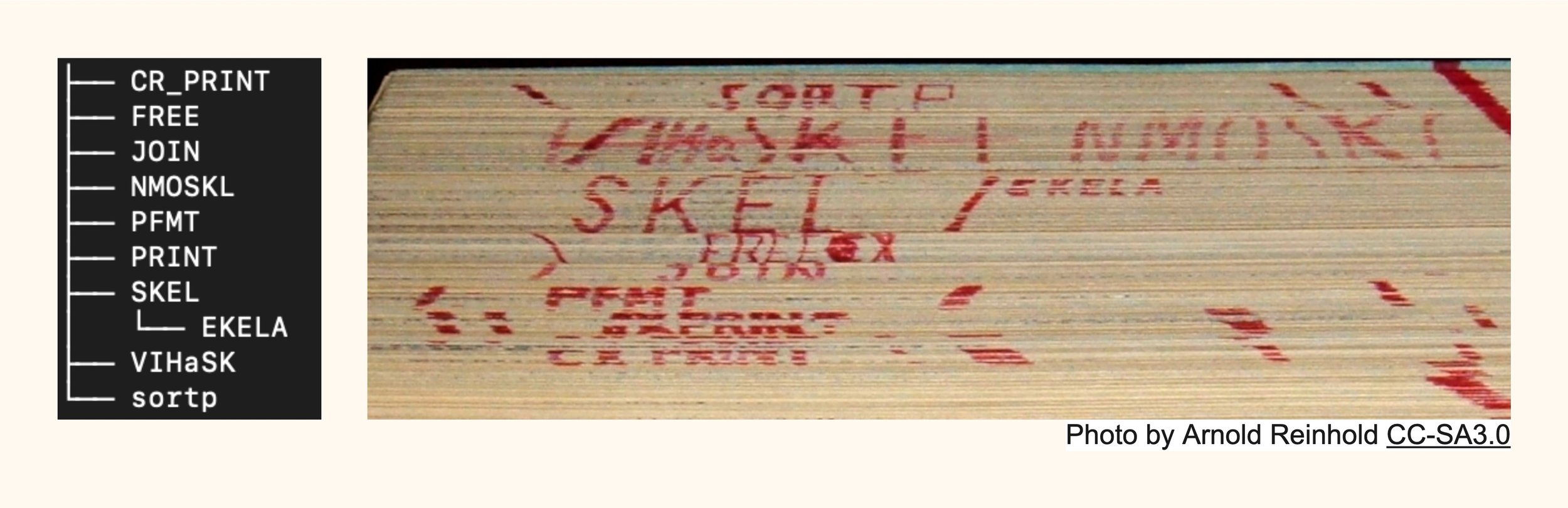
Missing in the diagram (folder listing) on the left vs the diagram (deck of cards) on the right: order is implied from top-to-bottom of the deck. Each section usually depends on one of the sections above it. This is something that was implicit in the 1950s that we lost when we moved from writing code in boxes of cards and moved onto digital file systems.
If you really want to go down a rabbit hole: why are we still using files in the 2020s to write code? It’s a constraint imposed by languages assuming they will have filesystems or hierarchical imports. We could probably do something much more interesting like store code along several different dimensions and project the organisation into the one we want to think about at the moment.
It turns out that application diagrams become more useful when they describe what logical things belong together, and what the interactions are between those things. However, I have found that “group by type of thing” is a great diagram when you want to explain an architecture in general (but not a specific application).
Take a look at this Django application to see the difference:
What is Django? It’s a Model-View-Controller style Python framework which comes with many features such as an ORM. What most MVC thinkers call a “controller” is what the Django universe calls “View”, and the “Template” is what most MVC frameworks call a “View”. You can create sub-sections of the django project into what they call “apps” (other frameworks often call them bundles, components, packages, or modules).

Confusing naming: “Django App“ in the big box might mean the entire project which is an “App” composed of many “Django Apps“, or possibly it is a “Django App“ itself and the larger “App” is not shown. How can you know what this diagram intended to communicate?
In this case, the diagram is able to easily explain the general abstract concept of how Django is wired together, but it tells you nothing of the specific application. What happens when we put application specific details in there?

Bonus points for those of you who who spotted the error in this mess. It’s going to be obfuscated for most people because there’s so much going on — maybe even the author will forget to add this detail (like I did). Also, with this detail it is clear that the “Django App” is spread out in this diagram, there is no individual view of an individual "Django App” (what other frameworks call “Modules”) it here.
Suddenly the diagram is not so easy to read, even in this very trivial case where everything is oversimplified we can easily predict how it would look in a mature application that’s a few years old. We understand that “an application” was smeared over some architectural buckets which contain “types of things” but we don’t learn much by reading this diagram without invoking serious brain-power. What if we flipped it around like we discussed before, and modeled the application by concepts our software models, rather than types of things in the architecture?

Someone might ask “isn’t that too simple?”. It doesn’t re-explain the framework architecture to you, it just explains the application structure to you. It doesn’t need to be more complex to be a good diagram, especially if the person reading it already understand the structure of django. However, it obscures the celery task which might be important to know if it is not standard in every part of the application.

This diagram is similar but it uses a lot of your attention to re-explain the django framework basic concepts to you multiple times (with no real benefit). You have to really think and explore it to find those two important details: Product uses Account models, and product has a celery task.
What’s different with these diagrams is that details or accuracy are a secondary focus instead of primary, and it’s not interested in mirroring the organisation of code. Instead it wants the reader to gain insights that help developers work on a project and understand it. Something they don’t already have easy access to with a file listing. Diagrams become more confusing when they are asymmetrical to the way code is organised. It can also get confusing when the diagrams explain two different structures at once (such as an application design (“product uses account“) and a framework design (Django MVC)). It’s too many competing stories being shared at the same time.
The way a programs is structured is not always the same as way code is organised.
Many developers like frameworks because they make a lot of the decisions for you about the architecture of a system. The problem is, they aren’t offering you decisions about your application and how the various ideas inside of it fit together. Often the program structure and the structure of a framework it uses should be entirely different views.
System-level structure
A lot of this post as been focused on “project level” code because the fundamentals are easier to grasp and easily translate to this “system design” level too. You know, the kind of diagram thing where multiple deployed stand-alone services talk to each-other with HTTP and use queues and databases, etc).
Here’s something that was created to try and explain a system architecture (I’ve changed a lot to hide the true origin of this diagram, but it’s a real case from a real company with smart people).

If you take a look at this diagram you’ll discover many of the same trends here: Yes, we understand there are three big boxes of deployments that all talk to kafka, each deployment has something inside of it. Now because this was a real situation I had the opportunity to ask the dev team to walk me through this, and some things might surprise you:
Nothing inside New Worker Service actually talks to Kafka.
All services talk to the Database inside Legacy directly.
Product Service talks to the Legacy service though the broker. Legacy puts messages into Kafka but nobody uses it.
Legacy Workers are written in a different repository and not really deployed with the database and web app, but they are considered to be together.
New Worker Service deploys the workers, API and Integration as one stand-alone project, they are not individual projects or run-times.
Everything inside of Legacy service is a monorepo, but all other services are usually made from multiple repos.
A lot of surprising contradictions can come out of a diagram like this, and it’s quite simple how: the meaning of boxes inside boxes was never agreed on and enforced. What one box inside another box meant was never kept consistent. The application of rules to create a diagram were improvised differently for every stage of the diagram.
This diagram is attempting to blend the “how I think about it” structure with the “how I write it” structure, the code organisation, and also “how it runs in production“. What makes it really hard to make this diagram into something useful is that we end up changing not only the conversation, but also the diagram never explains what level of detail and abstraction is used as it rapidly changes from topic to topic, so we have several moving targets for our readers to understand. In this case, the developers did model how they thought about the structure and not how they organised the code, however, how they think about their code is either unknowingly wrong or in some cases full of falsehood (some intentional “We don’t use kafka but we will put an arrow anyway“, or unintentional: “I didn’t think I needed to explain everything uses the legacy DB“).
It is not entirely without value, but we come back to many of the same issues we had at the start of the post:
It doesn’t help a new developer on-board faster to understand the changes they need to make and how.
It doesn’t help a team decide how to build their features, change their code, or identify risky parts. Or at-least, it’s not very ideal because it discusses concretions instead of the abstract system design.
It doesn’t help stakeholders really understand what was built, where the risks are, or how things are connected.
It doesn’t help communicate changes with other teams (assuming 1 team = 1 service box).
The value of this diagram doesn’t change much if we put lots or little detail we put into it.
This diagram is focused on providing accurate details about the system (however, the details are easily misunderstood because of the inconsistent meaning of what a box means, invisibility behind what systems actually depend on each-other, and falsehoods about the arrows). We don’t get insights about the system design itself. We don’t unlock much of that hard-to-learn knowledge by looking at this diagram. We force developers to essentially learn by slowly reading all of the code, talking to other developers who can explain it again or make even more ad-hoc diagrams of varying quality to try and “load up” that knowledge into a new developer.
Write-time code is Not run-time Code
When your program gets deployed or even run locally, you need to consider: does the project have several runtimes all doing different things? (Hint: for almost every modern web framework, you probably have multiple runtimes — background tasks, cron-jobs, queues, web daemons, command line apps, … all of these have different “run-time” diagrams from one another, and usually re-use some elements of the same code).
An often confused but easy point: just because some code is written in a mono-repo doesn’t mean that code must be a monolith either. A mono-repo or having multiple-repos is a place to write static unmoving code. It only comes to life when it runs on a CPU. Consider this: I’ve seen real mono-repos that deploy to several web-services with several runtimes each, and they also consume packages published that were written in that same repo but published as multiple stand-alone packages. I’ve also seen the total opposite: runtime-monoliths that are stand-alone repos which that consume hundreds of packages published from many repositories, and all of these “plug-in” to that thin project. How do you draw such boxes when you want one box to represent the write-time reality and run-time reality at the same time?
I’ve hinted at some of the challenges already, and in the next post we go deeper into the topic of “Run-time“ and how developers confuse their diagrams by thinking about their run-time diagrams and write-time diagrams at the same time.